Electric Dusk Drive In
Introducing the research and redesign of a drive in movie theater’s website for easier flow of purchasing tickets and better navigation.
Role
UX/UI Designer,
UX Researcher
Team
Dayeon Kang
Chris Martin
Tia Voight
Duration
2 Week Sprint
Tools
Figma, Google Slides and Docs, Zoom, Trello, Procreate
Problem
Drive-in movie fans want to buy tickets on the Electric Dusk Drive-In website, but they’re redirected to EventBrite, which can confuse users and lead to lost sales. Many don’t realize they’ve left the main site and often don’t return afterward. Additionally, accessing movie trailers requires another redirect, and navigating the main site for movie listings is often difficult. To boost ticket sales and enhance user experience, we should streamline the purchasing process and simplify navigation on the site.
Electric Dusk needs updated navigation for users to stay on their site and purchase their movie tickets and watch movie trailers without being directed to a third party site. By redesigning their website, Electric Dusk can save money and be more independent instead of paying for a third party to host their movie ticket purchases and movie trailers.
Solution
My teammates and I redesigned Electric Dusk’s website for the users to navigate easily and conveniently on their mobile device to purchase movie tickets, to view movie trailers without the site being directed to a new window, and to easily see what movies were “Now Playing”.
Before & After
Solutions (Mock Up)
Understand
Survey
Interviews
Observational Study
Ideate
Persona
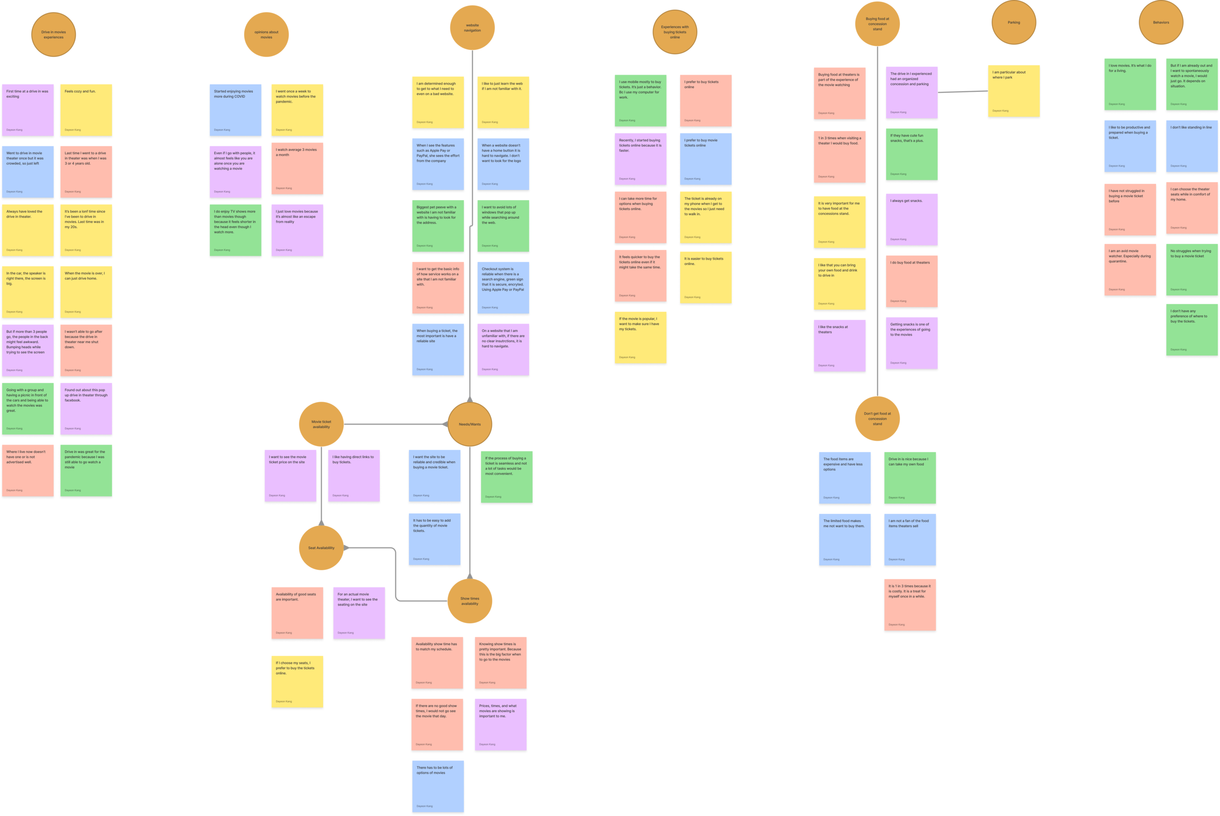
Affinity Mapping
HMW?
Competitive Analysis
Design
Sketch
Mid-fi Wireframe
Hi-fi Prototype
Test & Iterate
Usability Testing
Iterations
Understand
Screener Survey
To find suitable candidates for the user interview and observational study, our team did a screener survey. We asked questions such as:
Have you purchased movie tickets online before?
Have you been to a drive in theater?
What device do you use to purchase your tickets online?
16 responses total
User Interview
From the user interview, our team saw that the users were spontaneous movie selectors, most used a mobile device or laptop when purchasing tickets online, and enjoyed watching trailers for new movies.
Their pain points were that users had on the existing website was that they had a difficult time looking for where to click to buy the tickets on the main website, didn’t enjoy standing in lines so they prefer to buy tickets online, want to avoid pop up windows, want to see the price of tickets right away, and want to add the quantity of the tickets easily.
5 interviews total
Observational Study
The observational study helped our team to see the behaviors of our users.
We saw that users were confused when being directed to a third party site to purchase the tickets and wasn’t sure how to go back, the users were frustrated when trying to purchase the tickets, and some were confused where to find the movie showings.
7 studies total
Ideate
Persona
credit: unsplash
Name: Steven Jones
Age: 24, Graduate Student
Location: Los Angeles, CA
Spontaneous movie selector and enjoys hanging out with his friends.
Wants to look for movie tickets to a drive in theater on his mobile device.
He wants to browse through the movies that are showing and the trailers before making his choice.
Has to be able to quickly and efficiently navigate through the site in order to purchase his tickets.
Doesn’t enjoy waiting in lines
Wants more information on the guidelines because he is not familiar with a new place
Wants to quickly and easily use a reliable navigation system to purchase his movie tickets.
Affinity Mapping
After the user interview, our team collaborated and used FigJam to create an affinity map. We categorized them based on common trends and common pain points of Steven. The main results were he was
confused at navigating through the website to see what movies were showing and getting to buying the tickets
not enjoying waiting in line to buy tickets
not getting enough information on guidelines of the drive in
wanting to watch trailers for new movies
How Might We?
Our team used the “How might we…?” statement to help understand the problem better.
How might we make showtimes easily accessible?
How might we keep Steven to come back to the main site?
How might we make it easier for Steven to purchase his tickets faster?
Competitive Analysis
Design
Sketch
After I gained information from the researches, I created a sketch on Procreate of the wireframes for the new mobile browsing page.
Focusing on:
having the “Now Playing” movies on the homepage.
having guidelines on the homepage.
being able to see the ticket prices on the main site.
not directing to a third party site to watch trailers and to purchase tickets.
Wireframe
During design studio, my teammates and I collaborated about the sketches we each had created. Then, we created a mid-fi wireframe to help better visualize the site. After more iteration we then created them into hi-fi wireframes to prototype.
The main objective was for Steven to:
browse this site on his mobile device while he is out hanging out with his friends.
be able to easily view what movies are now playing.
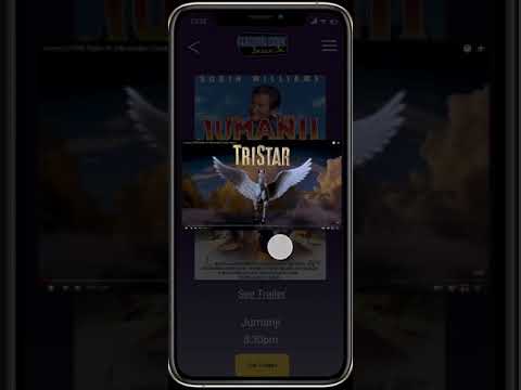
watch the trailer without the site navigating him to a third party site.
buy the movie tickets without the site navigating him to a third party site.
Prototype (Link)
Usability Testing
In order to better help with the usability of the prototype we created, our team met with 7 participants. They were asked:
Imagine you are out with your friends and you pass by Electric Dusk. You and your friends think it would be fun to see a drive in movie tonight. So you visit their website to see what is playing tonight. Can you show me what is currently playing?
You would like to view the trailer for Jumanji before purchasing tickets, how would you view the trailer?
You and your two friends decide to go watch Jumanji. Could you show me how you would buy tickets for yourself and your two friends and then check out?
You want to invite another friend with your group to Electric dusk but they are going to need directions. Where would you find the directions to Electric Dusk?
Your friend is debuting their new Indie film soon but they are having trouble finding a venue. You are wanting to help your friend and think Electric Dusk could be a great option for a private viewing! How would you gain more information about Electric Dusk’s private Events?
Through this test, we were able to find key insights that the users
liked that the navigation was not confusing and it was straight forward.
Purchasing the tickets was easy and simple to do.
Painpoints
One user wanted to be able to see the total price of the ticket before filling out the payment form
Another user indicated how they liked the private events page and would have liked that on the homepage for better advertising of the event.
System Usability Scale (SUS)
Iteration
Reflections
The usability tests indicated that users experienced improved clarity and ease of navigation with the redesign. By engaging with individuals interested in drive-in theaters and analyzing the collected data, I was able to identify the issues and develop more effective solutions for the website.
What’s Next?
Before sending this is developers, I will conduct a second round of usability tests to see if further iterations are needed.


