Falendar
Introducing a hackathon collaboration of a desktop app with software engineers where families are able to share their calendars.
Role
UX/UI Designer,
UX Researcher
Team
Designers:
Dayeon Kang
Inderjit Bedi
Software Engineers:
Ariana Nesbit
Ellie Lissner
Shawn Stover
Elizabeth Lukasiewicz
Duration
2 Days
Tools
Figma, Google Slides and Docs, Slack, Zoom
Problem
We all have calendar apps but it is not always so convenient or easily usable by older members of the family. We need to create a way for family members to share specific events and invite other members to their calendar so that family members are able to see each other’s availabilities.
Solution
We created a desktop app called Falendar where family members are able to share specific events, see each other’s availabilities, highlight upcoming events, focus on sharing calendar with others, and can be also used as a personal calendar.
-
Research
- Competitive Analysis -
Proto-Persona
- Goals
- Behavior
- Scenario -
Sketch
Design Studio
Design System
Mid-fi Mobile Wireframe
Mid-fi Desktop Wireframe -
Hand off to Devs
Understand
Research
Researched different mobile and desktop calendar apps to see how the competitors showcase their designs. (We also looked at Moleskin calendar mobile app but did not gain any data)
Ideate
Proto-Persona
Proto-persona was created due to the short hackathon. A proto-persona is not based on interviews or surveys but mainly based on our assumptions of the users.
Design
Sketch
Inder and I each started sketching mobile app ideas for our calendar app.
I focused on the Carson Family being able to :
view events and monthly calendar conveniently.
easily add events.
edit and delete events on the first page.
share events and see who it is being shared with.
Design Studio
After sketching, we came together and shared our own ideas and discussed what we wanted to add for our mid-fi wireframe. We focused on having:
weather icon on homepage.
upcoming events.
home page
Design System
Color palette was created so that we knew which branding we wanted to use for our app.
These pastel colors show the fun and friendly feel so that the Carson Family feel the want to use the app for fun and exciting events to share with their family members.
Mobile Wireframe
We created mid-fi wireframes after the design studio. This was done to show how we can present to the developers before creating a more visually finished wireframe. We focused on:
log in page.
weather icon on homepage.
upcoming events.
having colors to differentiate events.
confirmation page after inviting others to share events.
being able to see settings to manage who the calendar or event is being shared with.
Desktop Wireframe
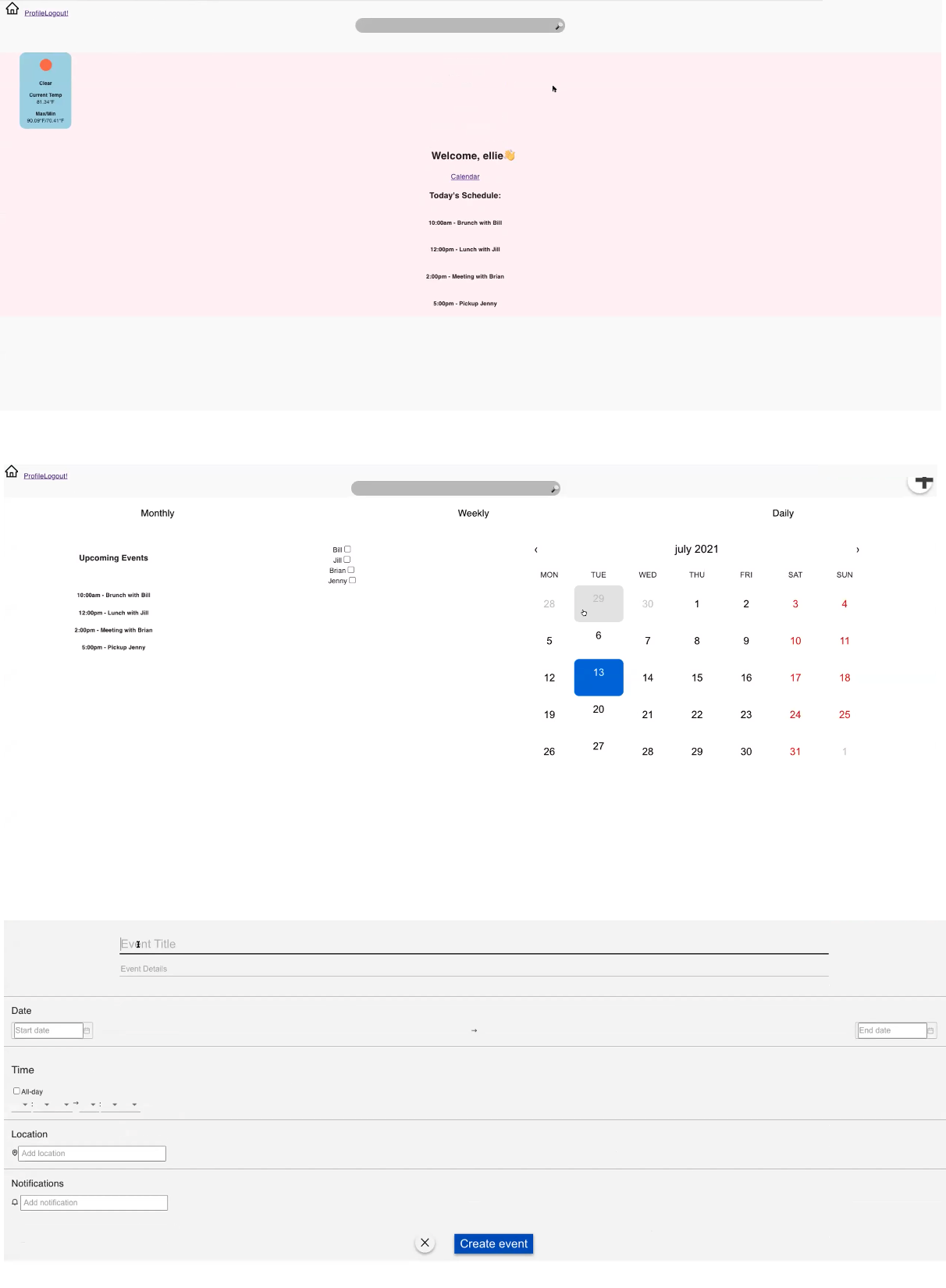
After the mobile first approach of wireframes, we created the hi-fi desktop wireframe. (This was done because the developers were not yet sure of how to create on mobile.) The Falendar desktop app was similar with the mobile app except that the Carson Family are able to select different methods of viewing their calendars such as monthly, weekly, or daily. Also, the upcoming events are always on the left side of the screen when they are using the app.
Hand off
Finally, after 2 days of nonstop research and design, we gave our hi-fi wireframe to the developers for them to code and create into an actual functioning desktop app. The developers were able to code from looking at our pdf files or screenshots.
Final product from Devs
Reflections
It was my first experience collaborating with developers, and it was a valuable learning opportunity. I was surprised by the numerous limitations and constraints we faced, including restrictions on coding, time, and technology. We also had to clarify our design thinking and terminology, as there were gaps in understanding on both sides. Despite the fast-paced two days, I gained insight into real-world work dynamics.
What’s Next?
Inder and I would conduct a usability test this product so that we are able to test our design decisions and then iterate based on the feedback we receive.


