Polished Manicure
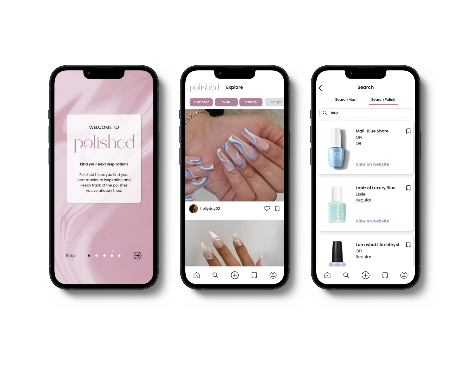
Introducing the research and design of a client’s startup mobile app, focusing on enhancing user navigation and clarifying its purpose.
My role:
UX/UI Designer, UX Researcher, Deliver Lead
Team:
Dayeon Kang, Ana Silva,
Tia Voight, Emmanuel Cruz
Tools:
Figma, Google Slides and Docs, Slack, Zoom, Miro, Zeplin
Duration:
2 Week Sprint
Problem
Our client has been working on her passion project for a while and wants to expand it to more audiences. There were problems in usability, functions, and not being mobile friendly. It is important for the users to be able to log their manicures, view other users’ posts, add to ‘want to try’ list, and save nail polishes to remember for the future.
Josie needs a way to discover new ideas and keep track of the nail polishes she loves and dislikes, allowing her to easily refer back to them in the future.
Solution
My teammates and I received previous research by our client. After synthesizing, reviewing, and conducting our own research, we redesigned Polished as a mobile app for easier usability and functionality, ensuring a more convenient experience for users.
Understand
Given surveys & Interviews
Contextual Inquiry
Ideate
Contextual Inquiry-
Affinity Map
MVPs
Persona
HMW
Hypothesis
In-Direct Competitive Analysis
Design
Design Studio
Color Impression Test
Mid-fi Wireframe
Hi-fi Wireframe
Prototype
Test & Iterate
Usability Testing
System Usability Scale
Iterations
Understand
Ideate
Conducted a contextual inquiry in order to get the users’ impressions, feedback, and usability ratings of the current app.
We were interested in learning more about how the users will navigate through the app.
From our research we found that users:
had a difficult time understanding the purpose of the app.
1/7 user was able to connect with the overall design.
were confused with ‘On My Shelf’ feature.
didn’t understand the difference of ‘Want To Try’ and ‘Colors I Love’
had a difficult time comprehending whether a task had processed.
MVPs (Minimum Viable Product)
Since there were more than 20 possible design choices that could be changed, we looked at the trending data and used the high value vs low effort method to prioritize those as our MVPs.
We found to prioritize:
clarity over design and functions of buttons
improvement in visual and UI design
improvement in browsing the app
user friendly searching feature
larger images
Persona & Journey Map
In-direct Competitive Analysis
Design
Design Studio
Design System
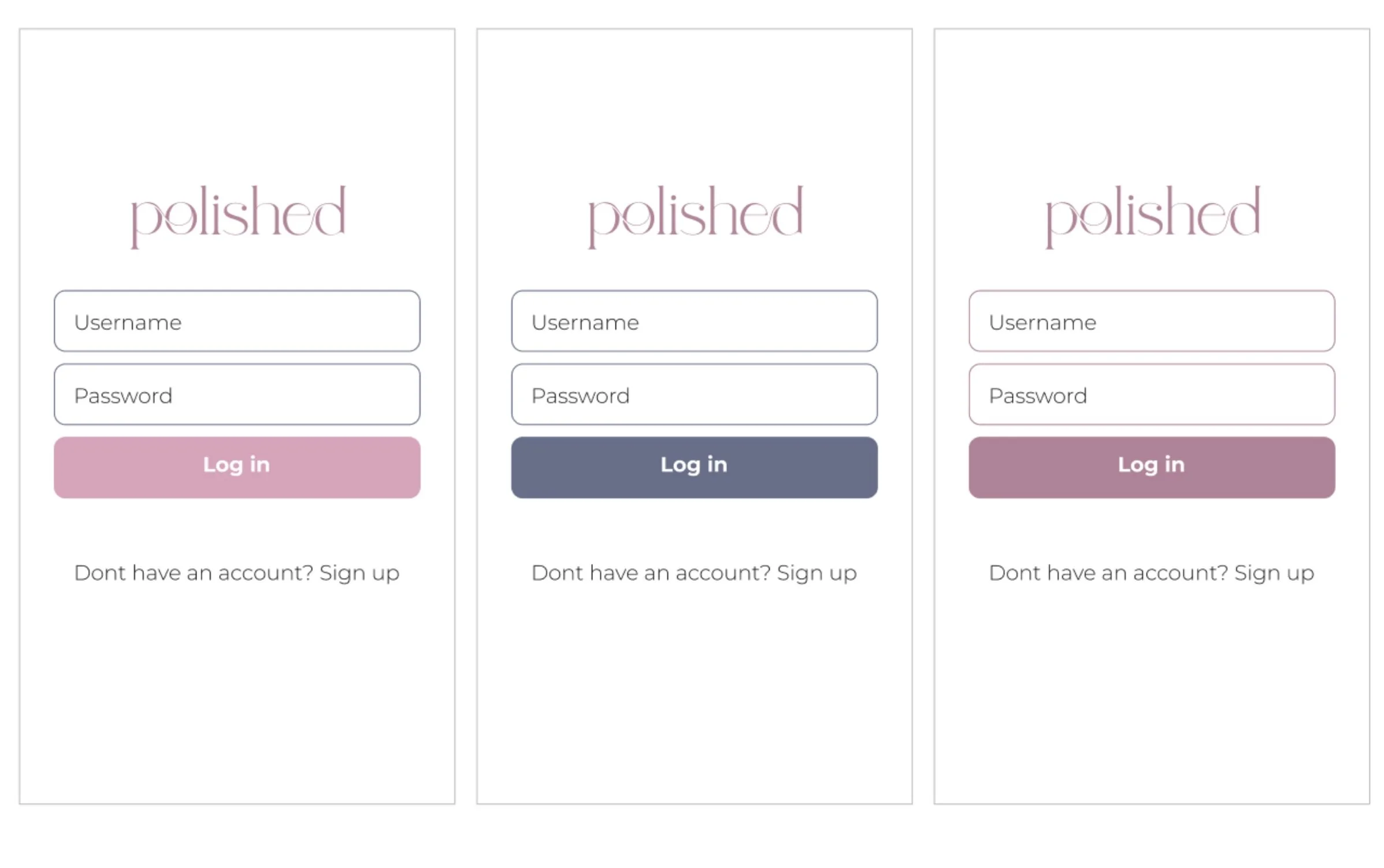
Color Test: First Impression
We tested three different branding options and gave participants 10 seconds to look at each of them.
Two colors came from the branding guide and one was inspired from the branding guide.
This first impression test is a method to quickly show a visual design with enough time for participants to from an impression of the design.
From this, we found out that:
4/6 users resonated with the original branding color and we were able to validate the current branding choices.
Hi-Fidelity Wireframe
System Usability Scale
System Usability Scale or SUS score was done for the current app and our team’s proposed app. This was done to see if there was any improvement in the usability of the app for our users.
Iteration
Through this iteration, we were able to present a refined design and showcase this to our client how this iterated version will be used by Josie. Now, this refined and validated design is ready to be handed off to developers.
Team Retrospective
Reflections
Our team effectively addressed user needs, delivered the required outcomes, and presented the prototype to our client. The client expressed satisfaction with the results, and we successfully completed the handoff with a sense of accomplishment.
What’s Next?
Given additional time, our team would conduct a second round of usability testing to explore potential further refinements. As the client expressed a desire to forward the prototype to developers, we provided a Zeplin file in our Google folder deliverables to facilitate a smooth handoff.


